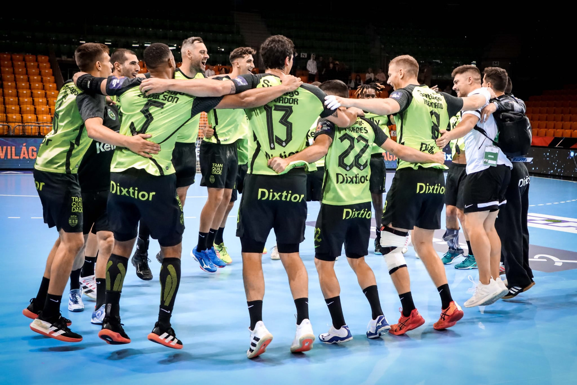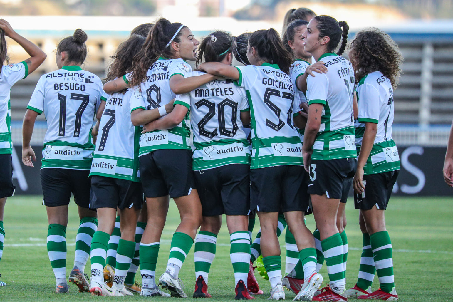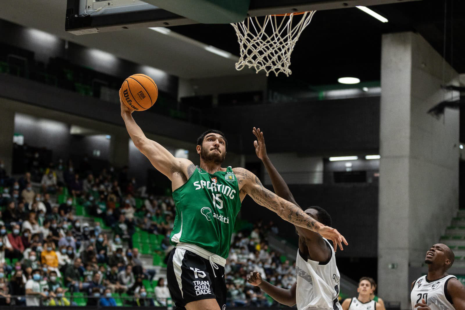


The purpose was to create a typography that distanced itself from the more rigid look of Names & Numbers that Sporting Clube de Portugal had been using the previous few seasons. Furthermore, it would be important the numbers had some characteristic from the club’s visual universe, exploring the idea of “claw”. The biggest challenge would be to create a typography with a dynamic aesthetics and a strong personality that could respond to the specific needs of a typography applied to the football industry, but at the same time allowing it to be use in a different context, such as club's communication, something unprecedented in portuguese football.
